
Responsive web design is web design, done right.Andy Clarke
The web is an ever-changing medium. Design styles come and go. Browsers constantly update, changing how they display design and code. Gone are the days where a website was only ever viewed on a desktop monitor (and when we could accurately predict what size that monitor might be!).
The world-wide web isn’t static anymore. I’m not sure it ever really was.
And your website shouldn’t be static, either.
What is responsive web design?
Put simply, responsive web design describes a site that has been designed to display a website’s content legibly and usably on any screen in any context without the viewer having to make any adjustments. The concept of responsive web design has been around for a long time, since the early 2000’s. But it wasn’t until 2010, when web designer and developer Ethan Marcotte coined the phrase in his ground-breaking article on the subject.
Why do I need responsive web design?
Until recently, it was common practice to design a website with only a desktop browser in mind. Designers would choose a width and height as their primary canvas for design, and developers would translate that design into an equally static webpage. There was little concern for how a website might look on different platforms, and it wasn’t unusual for mobile versions to be developed that stripped much of the functionality of the site.
As smart phones, tablets, and other forms of accessing the web became more and more prevalent, the static approach to web design presented lots of problems. It failed to respect the time and availability of users accessing the site on non-desktop platforms, which in turn negatively affected companies whose sites were failing to convert those users into customers or clients because of bad interface experiences. Creating multiple versions of the site was impractical, as no designer or developer can predict with certainty what screens people will be using.
Approaching a website responsively, however, concentrates on the user experience above all else. The design is conceived with the understanding that it will never look the same across browsers and screens and the acceptance that a design shouldn’t be identical everywhere. Instead, the focus becomes marrying a company’s brand with a user’s viewing needs — which creates a beautiful, usable, readable experience for all who visit your site.
Want to learn more?
Take a look at some of our responsive web designs, then connect with us. We’re happy to help.
Tagged: Design 101, Web 101
Like what you read? Sign up to hear more, and be sure to share on Facebook, Twitter, and Pinterest!


Leave a Reply
You must be logged in to post a comment.
-
- Team Works Logo
- A new company providing teambuilding adventures and experiences to allow personal and collective growth.
-
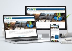
- Triad Engineering Website
- Custom designed and programmed responsive website with WordPress CMS. Triad has the ability to upload their projects, select the services provided and their site will automatically populate the appropriate services pages. See it live!
-
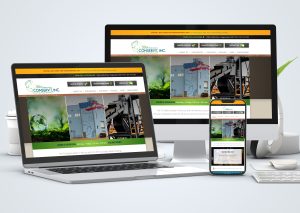
- ConservIt Website
- Web design and development for ConservIt in Hagerstown, MD. See it live!
-
- Shenandoah Air Conditioning & Heating, Inc.
- Website design and development for Shenandoah Air Conditioning & Heating in Kearneysville, WV See it live!
-

- Find Your Park CVB Ad
- An ad design for the Visit Hagerstown and Washington County Convention and Visitors Bureau, in cooperation with the National Park Service.
-
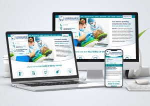
- Longmeadow Dental Website
- Copywriting, website design and development for Longmeadow Family Dental Care. See it live!
-
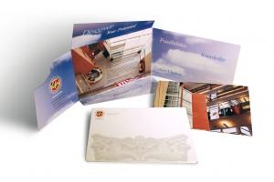
- USMH Self-Mailer
- Die-cut self-mailer designed for the University System of Maryland at Hagerstown.
-
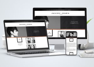
- JAGGER | JAMES Website
- Responsive website design for JAGGER | JAMES SALON.
- Learn more about this project.
-
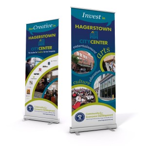
- City Center Banner Stands
- Design and printing of banner stands for the City of Hagerstown.
-
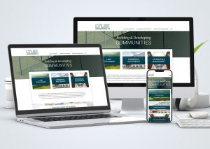
- Lyles Developers Web Redesign
- We redesigned David Lyles Developers website to showcase their outstanding residential and commercial developments, along with their incredible remodeling work. See it live!
Leave a Comment